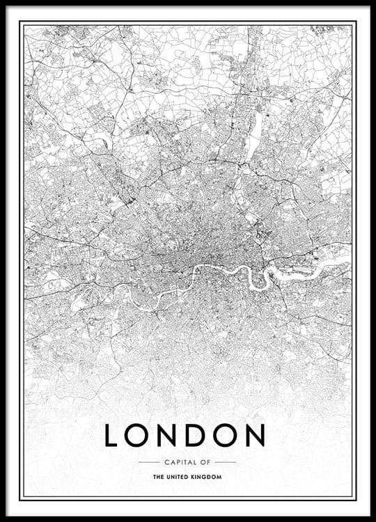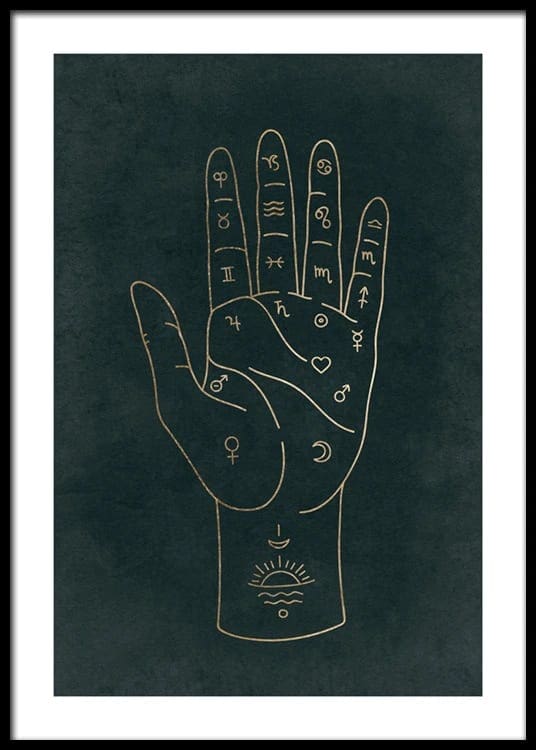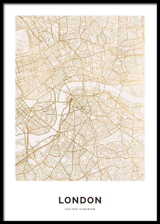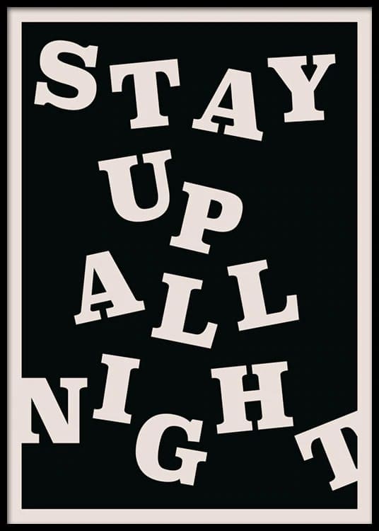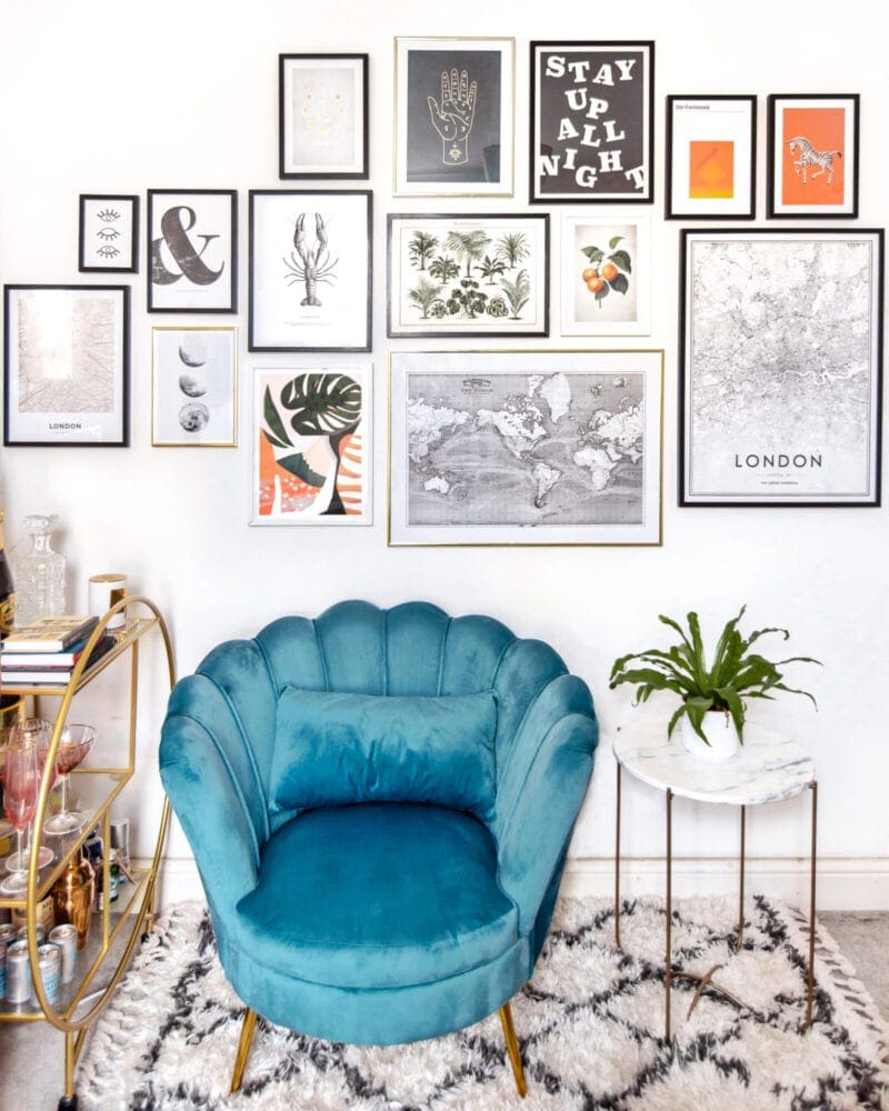
You know me, I'm all about clean, minimalistic living... yeah, right. My decor style is all colour, prints, and more is more! I could never be minimalist sadly, I love STUFF too much. So when it came to doing up my walls, a gallery wall that packs a punch was my first choice.
For those of you who aren't down with the interiors lingo, a gallery wall or art wall is basically a curated display of several prints or photographs arranged together to create an overall composition. However it's not as easy as just buying a bunch of posters, putting them in frames and popping them on the wall. I mean, you could do that, but it probably wouldn't look very good.
My gallery wall has been a process of careful planning, from selecting the right prints, to getting them to look good on the wall together. I got all my prints from Desenio, which were kindly gifted. You can use the code "ANOUSHKAP" for 25% off prints, valid until 14th May! This code is not available on frames or handpicked/personalised prints, and I don't get any referral commission fyi - just sharing the love!
I thought I'd put together a quick guide that outlines my process, from inspiration to finished gallery wall, in case you're looking for a little lockdown home decor project.
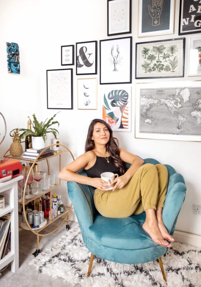
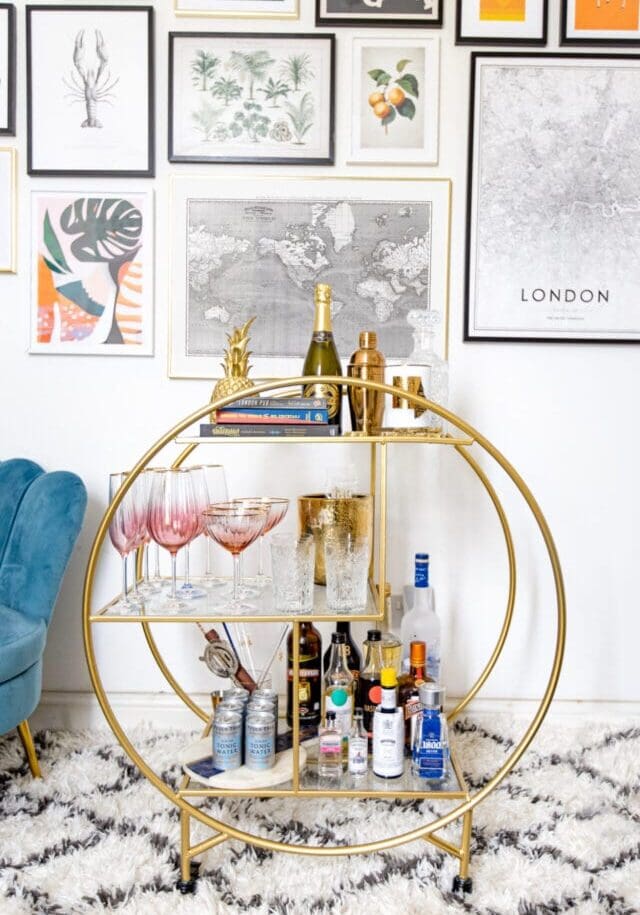
Find Inspiration
I'm a major Pinterest home inspiration hoarder, with countless boards dedicated to all things interiors. If you're looking for home ideas, Pinterest is the place! I started gathering images of gallery walls I liked in a dedicated board. From that I was able to get an idea of what my personal preferences are and what styles I tend to be drawn to. For example, you may find yourself pinning super neutral, black and white gallery curations, or prefer a more mis-matched, colourful look.
Choose a Theme
Though there is the odd amazing gallery wall where each print is completely unique and different, generally the most successful gallery walls will have an overall sense of cohesion. Personally I prefer more of an individual look and avoided it looking too matchy matchy (of course if that's your purposeful aesthetic choice, go for it!), but it's still helpful to choose a theme or two to ensure the prints work together. For example, you could have all frames the same, stick to a colour scheme, or graphic style (e.g. monochrome, abstract, vintage etc).
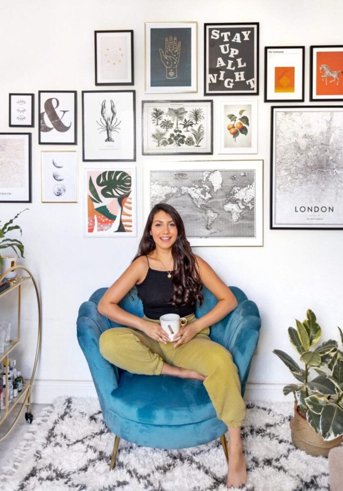
My print choices were fairly varied, but I still feel it looks coherent. I achieved this by avoiding photographs and sticking only to prints, and making sure there were a few of each print style - so each print has at least one similar "buddy" so nothing looks out of place. I've got several vintage prints, a few pops of colour (mainly orange and green), and gold running throughout in the form of both prints and frames.
Express your personality
You're probably going to be looking at these prints every day, so it's so important that each one is in some way meaningful. It can be easy to pick a bunch of prints that look really good together, but if they don't resonate with you in some way, you're going to get bored of it pretty quickly. For me, I've found I gravitate to prints that remind me of my travels, relate to London, or food and drink - all things I love! The rest I just really loved the aesthetic of, in this instance vintage and tarot/mystical prints for some reason! I'd recommend keeping your shortlisted in your saved wishlist for a week or so, then come back and see if you still love them.
Plan it out
One thing that can be super tricky is knowing what sizes to go for to ensure that the prints all sit well together. You could just order a bunch of prints in different sizes and see what happens, but it's a bit of a gamble!
Usually, I'll start with a few "key" prints I feel will look particularly good large, which form the core of the display, then work outward with prints getting smaller further out. In the past I've used Adobe InDesign (you could also use Pages or Word!), to roughly arrange the prints I'm thinking of getting in a document. It helps figure out sizing and an overall arrangement, plus seeing them all together in this format can help narrow down which prints to go for. If you're struggling to come up with a display, Desenio have a bunch of gallery wall templates which demonstrate ways you can assemble your prints together.
Make sure to measure the wall space too, to make sure you don't go too small or big!
Of course digital will always be a rough guesstimate, so when your prints arrive I'd recommend planning them out on the floor to see how they fit before you hang them. Once you've hammered in hooks you can't really keep changing things, so you want to be sure of your arrangement before they go up!
Get your prints up
Okay, now the hard part. I'll be honest, I got fed up and traded the weekly supermarket shop in exchange for hanging the prints with my boyfriend, because I'm impatient and don't tend to measure up properly, resulting in super wonky prints. One gap between prints that's too large or too small can really throw the whole thing off!
Make sure you have a measuring tape, hammer, hooks (or command hanging strips if you can't hammer into your walls, although I've found these aren't great with bigger prints), and a pencil to mark placement. If you have a spirit level, that would help too - we didn't have one and I'm convinced all the prints are leaning slightly right! You'll want to measure half the width of the print and how many inches down the back the hook goes to calculate where the hook should be hung. It's tricky, but you get the hang of it!

I hope this is helpful, and maybe even inspires you to put together your own gallery wall! Don't forget you can use ANOUSHKAP for 25% off Desenio prints until the 14th of May - let me know if you go for any, I wanna see what you get!

